FAQ color-test.org
This is a compendium of questions about the color constancy test at color-test.org.
What is color constancy?
Color constancy is a perceptual phenomenon where the apparent color of objects remains relatively constant under different lighting conditions. It allows us to perceive objects as having consistent colors despite changes in illumination.
Color constancy is an example of the brain’s tendency to predict causes of sensory input, rather than providing veridical percepts of the world. Simply speaking, the brain answers the question: how would an illuminated object look like under more neutral lighting conditions?
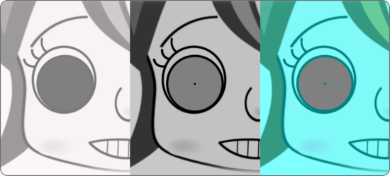
So even though the following three eyes have objectively the same shade of grey (try it with a color picker!), our brains conclude that they would look differently under more neutral lighting conditions.

What is the goal of this test?
One of a few aspects we’re interested in is to what degree the strength of illusory color perception correlates between colors. For instance, if you happen to have a relatively strong percept of illusory blue, do you also tend to perceive illusory yellow as more saturated?
Based on prior work, we already have strong reasons to expect such dependencies. However, less is known to what degree the correlations are similar between the colors. It is also the question that is less confounded by differences in user screens and ambient light conditions.
We are also very curious whether — based on the color ratings for the different illusory color categories — we can identify certain “perceptual fingerprints” that predict what observers see in The Dress and similar images. It might tell us something about the mechanisms involved and why humans differ so much in their subjective percepts.
More generally, we aim to characterize factors that influence the strength and the patterns of illusory color perception: age, gender, country of origin, ambient light, screen, time of the day, time of the year, visual hemifield, and many more.
What are the limitations of this test?
Obviously, this is not a laboratory experiment. We do not control the user device. The screens of different devices will be spectacularly different, introducing huge variability to our measurement. Ambient lighting conditions likely play a huge role, too.
Experimental tests often have to pick a trade-off between two factors: tightly controlling the experiment versus access to a large number of subjects. This test is certainly on the latter extreme.
These various uncontrolled factors are an annoying source of noise. At the same time, it allows testing to what degree these factors influence illusory color perception (see above).
Nevertheless, given that we cannot randomly assign who uses a smartphone versus a laptop, who does the test in a light versus dark room, there will always be an issue of causality. The chicken and egg problem. For instance, if we found that people on smartphones perceive stronger illusory colors, you could always argue the other way round, i.e. that people with stronger color perception have (for whatever reason) a preference for smartphones over laptops. While some of these reversals seem unlikely, they have to be considered.
Did all eyes have the same shade of grey?
No. As you likely realized, in a couple of stimuli the illumination of the face was neutral and the eye color was nevertheless clearly different from default grey. These stimuli serve as a control to measure how accurately an observer uses the color wheel under neutral lighting conditions. Apart from these control stimuli, yes, all other eyes had the same shade of grey.
Is “The Dress” an example of color constancy?

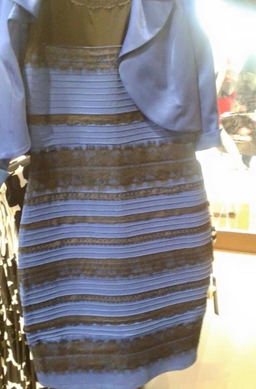
Yes. When looking at The Dress, the brain estimates the lighting conditions which in turn influences the perceived color of The Dress. This is the core mechanism of color constancy. Indeed, The Dress contains quite a few (though ambiguous) cues about its lighting conditions.
The main point of The Dress is that humans can arrive at different conclusions about the “true” color of an object (“true” as a shorthand for “under more neutral lighting conditions”). This may be because they estimate the illumination differently, or because they discount a given illuminant differently. In either case, it goes to show that the mechanism of color constancy can be different between individuals.
Acknowledgements
- Akiyoshi Kitaoka, who’s work inspired this website; who’s stimuli were adapted for our purpose; who’s illustrative tutorials facilitated the creation of adapted stimuli.
- GitHub user iamapig120, who put their implementation of a Javascript color wheel in the public domain. Only slight adaptations were necessary for this test.
- Marek Němeček, who gave lots of technical input to the creation of this website.
- Barbora Wolf, Denise Kittelmann, Cheyenne Cavender and Elena Korchagina, who gave valuable feedback during the development.
